Although this blog post is a few years old, I'd like to shed a little light onto why boarding passes haven't changed in years.
To redesign the boarding pass, you have to understand how the data is processed and presented. Often the terminals and printers are shared between airlines, so there has to be a standard.
Each airline uses something called a PECTAB. This a basically a template that has coordinates of where the data is to be printed (text & logo). It's loaded on the printer each time the airline terminal application (such as Sabre, Amadeaus, etc.) connects to the CUTE (Common Use Terminal Emulator, IATA standard) API hosted on the computer which acts as a gateway to the printers, OCR scanner, etc. Did I mention this is a shared terminal by several airlines that have completely different applications? :)
A lot of the BTP (boarding pass) printers either use the older dot style printing, but the newer thermal (GPP) printers are becoming more common because they are cheaper to maintain.
Unfortunately, the terminal emulators and CUTE standard hasn't kept up to date with the available technology, a lot airlines are still running on mainframes from 25+ years ago.
>a lot airlines are still running on mainframes from 25+ years ago
That's really not related to this topic at all. The TPF mainframes have little to do with how the boarding pass looks. That functionality is in other systems/code.
The TPF mainframe for most airlines at this point is just a big nosql database, surrounded by a bunch of other systems that aren't old. If you replaced it, the customer facing stuff wouldn't look or act much differently.
The sprawl of the applications around it, and the lack of consistency across those is actually a bigger problem than the TPF mainframe.
That doesn’t make any sense, considering the use of mobile device boarding passes. My guess is there is a bridge developed to translate those boarding passes to PECTAB format for submission to common systems?
See my other comment - they have actually changed a bit, and it's perfectly possible to produce better designs with the existing tech (not the colorful ones though).
I like that we are integrating more and more well designed products and utilities in our day to day life; beautiful, easy to use objects are no longer a luxury. That by itself is a glorious win.
People, however, tend to forget the old but gold adage: "Form follows Functionality". I mean, this talented designer ventured into poking fun of the work of other people without even taking the time to understand the problem, the proposed solution, and the constraints that were/are in place.
Yes, his design is infinitely more good looking. But did the designer took into consideration how applicable is it in the real world, with real logistics and real business scenarios? No. Of course he didn't.
The reason I'm saying this is because I suffer those atrocities every day in my work, were I'm tasked with the coordination between journalists and designers for a business magazine.
Where I work, we believe that infographics' main mission is to help readers wrap their heads around things they wouldn't if we presented them as text or tables. That's the point of them being there in the first place. Making them pretty is just a way to make people look at them, and be happy while they learn something new. It is so satisfying to create such pieces.
Designers, however, seem to discard all of that, caring only about how trendy the damn gradient is. I was even called ignorant and 'noob' by a designer, one that I fought to recruit a week earlier, because I suggested making numbers readable, something he deemed old-fashioned and would ruin his master-fucking-piece.
I really hope that people will be more aware that design is not a goal by itself; it's a tool to make people care, learn and be more happy.
To add on to what you said, I believe the designer forgot one more thing. From what I remember (haven't looked in awhile), these companies are on paper thin margins. They try to shave every last cent they can. By switching to the visuals that the designers came up with, it would add to an increased ink cost.
This calculation won't even try to be accurate, but rather for argument purposes. The design that has the large black rectangle of black could add an extra 8in^2 of black printable ink. okay... I'm too lazy to look this up, but let's say they print 20m of these a year, the ink cost would add up for that redesign.
> Designers, however, seem to discard all of that, caring only about how trendy the damn gradient is. I was even called ignorant and 'noob' by a designer, one that I fought to recruit a week earlier, because I suggested making numbers readable, something he deemed old-fashioned and would ruin his master-fucking-piece.
I suspect a lot of designers are really just designing for dribbble/Behance portfolios so they can finally climb the ladder to Art Director.
Absolutely, and that somehow makes me sad. I hope that the designers who don't yet, understand the grandiosity of their mission and give a goal to their pieces, beyond the instant gratification of fast rotting eye candy.
> People, however, tend to forget the old but gold adage: "Form follows Functionality". I mean, this talented designer ventured into poking fun of the work of other people without even taking the time to understand the problem, the proposed solution, and the constraints that were/are in place.
Can you list actual problems with the proposed solution? What is the function of a boarding pass? It has 3 users:
* Computers - they don't care much about the layout as long as all the information is there. See the comment about "CUTE".
* Humans who work at airports (security, boarding crew, flight attendants) - they too want to be able to parse them quickly. They'll easily adapt to every layout because after a single day they'll have seen a few hundred boarding passes with the same layout.
* The passenger - they want to be able to parse it quickly. I don't know how often I was looking for a specific information on my boarding pass and actually had to read all of the damn thing to find it. I fly with various airlines and I am the only one who cannot be reprogrammed or trained by looking at a few hundred passes. So I'd say the most important/constraining function is to be understood by the passenger.
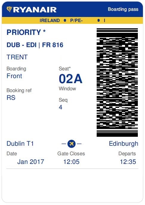
The article spells out the problem the redesign tries to address: So I stared at it for a while. Rubbed my eyes, then stared at it some more. It was like someone put on a blindfold, drank a fifth of whiskey, spun around 100 times, got kicked in the face by a mule (the person who designed this definitely has a mule living with them inside their house) and then just started puking numbers and letters onto the boarding pass at random (yes, I realize that a human didn't lay this out, if a human had, judging by the train-wreck of design, they would have surely used papyrus). There was nothing given size or color importance over anything else, it was a mess.
The only problem I have with most of the redesigns proposed is the amount of ink used - I'd prefer a design that takes environmental impact into account because those boarding passes have to be printed, then are used once and thrown away.
> Yes, his design is infinitely more good looking. But did the designer took into consideration how applicable is it in the real world, with real logistics and real business scenarios? No. Of course he didn't.
> It was like someone put on a blindfold, drank a fifth of whiskey, spun around 100 times, got kicked in the face by a mule (the person who designed this definitely has a mule living with them inside their house) and then just started puking numbers and letters onto the boarding pass at random (yes, I realize that a human didn't lay this out, if a human had, judging by the train-wreck of design, they would have surely used papyrus). There was nothing given size or color importance over anything else, it was a mess.
Notice that only the last sentence attempted to actually critique the current design. Every single word before that was absolutely useless.
So no, if you actually read it properly, the excerpt doesn't even present a weak argument for why boarding passes should be redesigned.
Small anecdote: in my 15 years of flying using 5+ international carriers, I have never once had trouble getting the most important information from my boarding pass (gate and seat numbers).
The problem with these design critiques is that they are usually very subjective, and provide little rationale for the proposed changes rather than "it's better" in some nebulous way.
How about having a bake-off between the old design and the new design, measuring actual business metrics. Does the new design move the needle on things that actually matter to the business? The airlines no doubt have business measurements around boarding speed, airline employee efficiency, etc. A/B test the old and new design and then if the new design outperforms the old, then you have the start of a cost benefit analysis.
When I used to write mobile apps I'd always butt-heads with the UX designers who would say things like "this control is more usable" and "we should go with a warmer color here". Great, prove it! Test the 41 shades of blue[1]! Measure your hypothesis vs. what we have. If the new design's better usability will bring in more revenue than the old one, we should have no problem justifying it.
> Notice that only the last sentence attempted to actually critique the current design. Every single word before that was absolutely useless. [... ] the excerpt doesn't even present a weak argument for why boarding passes should be redesigned
It does? ~"The information important to the passenger does not stand out." The introductory rant may not suit your taste, but it can be a pleasant reading for people who don't feel personally offended by it. And, in my opinion, for a blog post, the signal to noise ratio is actually pretty good.
Nope, that's simply wrong; the important information does stand out.
Look at the original pass at the top of the post. What is the most important information? Is it emphasized more than the rest of the information on the boarding pass?
> The only problem I have with most of the redesigns proposed is the amount of ink used - I'd prefer a design that takes environmental impact into account because those boarding passes have to be printed, then are used once and thrown away.
Boarding passes don't use ink, they use thermal paper. There is a tiny increase in electricity usage from printing more on thermal paper but it's truly miniscule.
"I mean, this talented designer ventured into poking fun of the work of other people without even taking the time to understand the problem, the proposed solution, and the constraints that were/are in place."
I find the tall skinny letters are much harder to read and random elements like the country map just add clutter. Giant color backgrounds are also distracting and probably make printing more expensive while lowering quality for people who print passes at home.
Overall I prefer existing boarding passes, which aren't actually that complicated these days. Also many people now use digital passes on their mobile phones that are much easier to use with built-in intelligence and real-time updates.
I think the new design is worse than the old design. Not a fan of the narrow font, crowding, and tiny labels (following, not leading, the numbers) for category. Am I flying from gate 22A in seat 11B or vice versa?
The labels for what the number IS should be nearly the same size as the number itself.
The departure time is listed, but the boarding time is not. The boarding time is more critical to know.
> The departure time is listed, but the boarding time is not. The boarding time is more critical to know.
I disagree. Airlines often lie about boarding times - the number of passes I've seen where the boarding time is 1 hour before takeoff. At some airports I'm still in bed 1 hour before takeoff!
Unlike the author of this post, West actually endeavored to understand the constraints and requirements before undertaking a redesign. That's the mark of a truly competent designer.
I dislike his redesign, because most of what he does is fix the fact that it's ugly. Large-printing the numbers is pointless when the labels are still teeny-tiny and the layout of the tearable stub doesn't match so it's non-obvious that it contains the same info.
Imho, the tearaway should clearly repeat the layout of the big one so the reader can see "this is the same".
I'd sort the data in order. Putting the zone at the end is wrong because you don't use it after the seat. First you need flight number and time, then you gate days where to go, then your zone says where to go, then your seat says where to go. It seems obvious to sort the data like that.
Yeah, I liked Julian Montoya's design the most because its vertical layout immediately conveys a hierarchy of data (though the gate number is omitted). The other designs, while aesthetically novel, required my eyes to jump around to gleam meaningful information.
My problem with Montoya's design is that he used 3 letter abbreviations for the cities... You need the full name. 3 letter airport abbreviations are jargon that should not be the core of user-facing interaction.
They can be important. It's important to know if you're flying to LHR or LGW (for London), esp if you're at an airport where planes of the same airline leave to both. Identifying the flight by flight number is often problematic if it's a codeshare flight (displays at the airport only show one or switch infrequently), so identifying by airport and flight time is easier.
One thing that these types of articles tend to overlook is consistency across the different types of boarding passes.
You have home printed boarding passes that will be printed on all sorts of awful printers, with bad settings (like printing color to a b/w printer) and poor resolution.
Then, some will be printed on thermal printers at airports, and some on airport controlled thermal printers, some on airline controlled thermal printers. Different models, with different stock, etc.
Finally, the mobile boarding passes.
The employees checking these do better if there's some uniformity across the various formats. Similar for customers.
So, there is a bit of "lowest common denominator" in the current designs. It's on purpose.
I guess that depends on where you're flying from. The only airport in the last couple of years where I've even had a boarding pass was RIX, otherwise it's always just stored on the frequent flier card.
The paper itself is another problem with modern boarding passes. I miss the old-style boarding passes (the kind you'd find a magnetic strip on), when they were printed on thick cardstock (that wouldn't rip if you put them in a pocket or in between the pages of your passport) and not the thin and squicky BPA-infused thermal paper that almost rips on its own.
I mean why do you need one? Most of the flights I take in Scandinavia don't have boarding passes I just use the credit card I used to buy the ticket. If a boarding pass is needed I can get it in the form of a QR code on my mobile when I check in online.
I personally avoid the mobile app. I have no data plan on my phone, and airport WiFi is not exactly known as the best (or safest). I also have this (probably unfounded) fear of my battery failing and having to go through a bunch of extra effort to get a printed one anyway.
It's interesting that the pass has the boarding gate printed on it. I've only flown in Europe (and only started around six years ago), but the gates are available only half-hour or so from the closing time. Is it common in the US to know the gate in advance?
Almost always. It's nice because the terminals can be rather large and if you're going to grab a meal prior to departure, you'd want to go to a restaurant that is near the departure gate. Also, different gates used by the same airline are sometimes in totally disjoint post-security areas. Are these things not problems in Europe?
Europe has airports ranging from some of the world's biggest (LHR, CDG) to some of the smallest.
At some airports, all flights will be international (e.g. Shannon). At others, all flights will be domestic or within Schengen.
Some airports are almost entirely used by budget airlines (London Luton), others have very few budget airline flights (London Heathrow).
That leaves plenty of flexibility for how the airport is operated. I'd expect a gate printed on the boarding pass as the larger airports with longer, non-EU flights. I'm not surprised when a Ryanair flight only announces the gate a short time before departure, since they have such a short turn-around time everything seems to be last-minute.
In the airports I've been to, I don't remember the restaurants being near the gates, but all together in a food court. So I guess you can't really grab a meal near the gate anyway.
As for the security, not really, in my limited experience. My home town's airport does have two separate terminals, with independent security areas, but different airlines fly from each.
I have been flying mostly within Europe, and have never seen this. For my flights gates are usually printed on the boarding pass and known well in advance (sometimes they do change, however). Half an hour before the gate closes seems quite impossible to me... how would anyone be able to make their flight on a decently big airport?
It's a huge pain - you have to sit in the central waiting areas, but can never really relax because you have to be alert for when your gate is available on screen.
Sometimes if it's far you'll need most of the time to get it. It's this way in London and I've definitely seen it a lot of other places in Europe too.
You know which terminal you're flying from, and I've yet to see an airport where you can't get from the central waiting area to the farthest gate in 15 minutes or less (20 if you walk slowly)
Yes, most airports print the gates on the boarding passes. A handful (mostly ATL) just give up, because they can't reliably predict the gate until 30 minutes before boarding.
Isn't it just the UK with this horrible practice? I've flown a lot in Europe and UK airports are the only one that display gates shortly before, even if the plane is already parked at the gate. I guess it makes people buy more food in the waiting area...
The main issue I have with this design is that it doesn't account for the cost of implementing the proposed changes.
For paper boarding passes, it's prohibitively expensive to upgrade the printers and self-check-in kiosks to support new-fangled boarding pass layouts. Plus, you have to do it at every airport around the world.
It would be far cheaper to have some professionally printed full-color paper templates to feed into the printers (see, for example, Virgin America boarding passes issued at SFO).
Plus, iPhone Passbook tickets are uniformly designed, and have the key information (seat number, boarding time) in slightly bigger bold font at the top. It would be far cheaper to get an airline to install eTicket readers (aka QR code scanners) at the few small airports that don't have them, and then to upgrade their mobile apps to support generating Apple Passbook boarding passes for the remaining ticket types that don't work (e.g. group fares).
Let's look at this from a tired traveler perspective. Not sure whether you had the joy of being on the other end of a transoceanic flight but typically by that time you have been up for too long, stressed from packing, passing security, immigration then sitting 10-12-16 hours in an overpressurized dry aluminium tube.
Your brain wants to shut down. You are staring at this piece of paper which has the flight number, the gate number and the seat number in roughly the same size, the same font and in every which way visually the same.
I did get dangerously close to mixing up my gate with my seat. More than once. It's an atrociously bad design.
And it's not that hard to improve. All it needs is more folds. First fold, flight / gate. You don't give a shit about seat so hide it. This doesn't require new printers , new standards or shit. Just one more fold in the paper. Is that so hard?
As someone with a suffix in their name, I'd like if the name portion could just stop corrupting my name. IIRC, the last airline took:
  First Name: John
  Middle Initial: Q
  Last Name: Smith
  Suffix: III
as input (in separate fields!, and in the above order) and printed that as:
JOHNIII SMITH Q
Note the lack of space separating the given name and the suffix, the odd positioning and ordering of all of the elements of the name…. This is nowhere close to how its represented on my legal ID, and I've never in my life written my name that way.
Then you take this boarding pass to security, where a TSA agent squints at it thinking to himself "this is definitely fake", until the barcode scans and it comes back as good.
The first thing I couldn't help but notice was how much ink these new designs would use! That seems like a major design flaw for an industry with such tight margins.
Thoughts on having one "website" for a blog post? I think its kind of cool - gives more weight to the post. But it definitely creates a disconnect between the author and the post.. I can't navigate to the author's site for other work, or to find this blog post again, etc.
It has some of the changes seen in his redesign, but still a lot closer to the original one from Delta. I think it's perfectly fine and practical, despite not being exactly visually pleasant; all the information I care about is in big bold letters at the top, without any strange codes or abbreviations.
It's great that so much thought has been put into the design that is printed on boarding passes, but one thing that's always bothered me about them is the physical size.
Every passport is the same size, and you almost always are carrying your passport while flying.
If boarding passes were the same size as passports, they'd fit inside much more easily and make it a lot more convenient to carry.
Sure, the design printed on the paper is important too, but IMHO the size of the pass is far more important!
>you almost always are carrying your passport while flying.
What? Flying internationally is a rare event even for rich people (business travelers excepted). Most of us will do it a handful of times, or not at all. I'd estimate the vast majority of flights to be domestic. You just use the photo ID that's already in your wallet.
If you don't want to carry an additional object, just put it in Passbook on your phone using the airline's app.
There's a purely practical thing that these need to deal with: sometimes when you board you hand over the end stub and keep the large portion, and sometimes you hand over the large portion and are given the stub .... This means that all (or enough) information needs to be on both bits .... You can't just put the seat number on one bit (or the flight number on one bit, as you may need it for customs forms later) etc etc
I like it, I think it's more readable compared to the one that they show as a current one on the top. It took me a while to find a departure time and gate number on the original boarding pass. All the important pieces like flight number, seat and departure time are really easy to read compared to the original.
The problem on the original is that they don't emphasize the important information pieces, all is printed in the same font style and size.
I really dislike comments that are negative about design when someone has spent a lot of time researching the problem and the commenter has not. With that said, here is me doing that exact thing:
I agree with usaphp. With equal visual hierarchy, it's dismissing the fact that you care about some items 0% of the time and some items 100% of the time. And this difference between these states can change in minutes. For example, I don't care at all what my seat assignment is until I'm on the plane. I don't care at all what zone I'm boarding until I'm at the gate. I don't care at all what gate it says because gates change all the time. Even if I used mobile kiosk for check-in and it gives me a gate, there's a non-trivial chance that by the time I get to the terminal, that gate has changed. I do not rely on the gate assignment on my boarding pass, ever.
Similar items are not grouped when they should be: such as boarding time and gate.
And the font is not glance-able. It's a nice font that takes little width, but unless they start changing code share codes to "DL50,381,172", there's a ton of extra space that could be used. (of course whitespace is valuable too, but squishing information together for the sake of squishing it together is not a wise design decision.
Regarding someone's comment about color/shitty printers - this kind of design would require two designs: one b/w and one color. The strength of the reds and blues would take over the important information.
Meanwhile for Qantas in Australia on domestic flights, you just tap your frequent flyer card to check-in and scan it's barcode at the gate to board. It does print a small slip with your seat allocation on it at that point though.
Now someone just has to build e-Ink into the card.. which I know has at least partly been done by some of those virtual credit card startups.
I know KLM recently introduced boarding documents you can print and fold four-ways so that it was pretty much the size of your passport and if you have a two-flight connection there would be one on each side.
The overall details are pretty well laid out as well.
I'd post an example, but the only one I have is my own boarding pass, so that's not really an option.
I quite like the idea of folding it so that you only see your next immediate step at a time. For example, first step is gate number and time to be there. When you're there, you fold it over and it shows you your seat number.
Amen brother. I often ring to get a taxi to meet me at the arrival - with current design I have to look it up separately as opposed to on boarding pass... Also an indication of predicted flight time is really useful (even if subject to change because valid at time printed).
The design is worse to me. Black background for reading is a bad idea, and there's a lot of things competing for attention because everything is so big. They could do with better font too... way too hard to read and thin.
White background + gotham font + white background + proper spacing + a splash of color = win
If you have checked luggage, they print boarding passes for you and stick the baggage tag labels on the pass. At that point you have a paper pass so using the mobile one doesn't make much sense.
Also, if you are traveling internationally, the boarding pass is mandatory for the various security and immigration stamps.
Boarding passes used to be on glossy cardstock with preprinted designs and lots of color. Now they're basically thermal printed on receipt paper because it's cheaper.
Depending on your airline and class of travel, sometimes you can still get a nice boarding pass.
Designer should understand that boarding pass at today, should no longer be designed, instead, software should be written to handle those things automatically.
The technology to automate boarding is already there and are very mature.
Not sure I fully understand what you're concluding. If it's handled automatically, how do you get the passengers at the right gate, at the right time and in the right seat?
To redesign the boarding pass, you have to understand how the data is processed and presented. Often the terminals and printers are shared between airlines, so there has to be a standard.
Each airline uses something called a PECTAB. This a basically a template that has coordinates of where the data is to be printed (text & logo). It's loaded on the printer each time the airline terminal application (such as Sabre, Amadeaus, etc.) connects to the CUTE (Common Use Terminal Emulator, IATA standard) API hosted on the computer which acts as a gateway to the printers, OCR scanner, etc. Did I mention this is a shared terminal by several airlines that have completely different applications? :)
A lot of the BTP (boarding pass) printers either use the older dot style printing, but the newer thermal (GPP) printers are becoming more common because they are cheaper to maintain.
Unfortunately, the terminal emulators and CUTE standard hasn't kept up to date with the available technology, a lot airlines are still running on mainframes from 25+ years ago.