>> "First, images are out-of-proportionally big. They steal the attention away from the texts... You eyes will inevitably look at Larry’s face and the new Android Studio but did you notice much of the text at all?"
I think this is the point. I can immediately tell what these posts are about via the image without having to read anything. I can then read the details if I want. Also, If G+ is anything like Facebook one of the most shared content types is photos so it makes sense to prioritise them.
>> Third problem, the lack of discipline in using the whitespace. Whitespace is one of the most powerful, visually pleasing and least intrusive way to bring orders and visual hierarchies to a design. Yet what do you think of the whitespace in this Best of #Python page?"
This seems like a bad example. Normally that whitespace (the link) would contain an image and some text previewing the link. They just couldn't parse it from the webpage. In this case the OP just picked an example to fit his complaint.
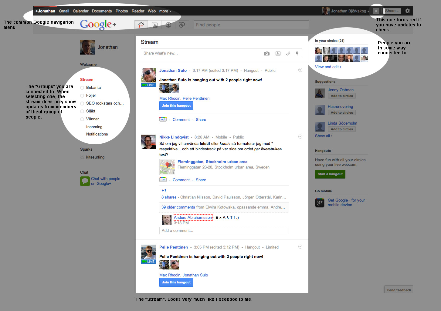
I commented earlier that I had a hard time figuring out the chronological order of the posts in the stream. I've learned since that Google doesn't want us to care about that. Fine, that's their prerogative. But now I have a new problem: I don't know how to read this thing at all. I can't read it "by column," that is, one column after the other, because it's infinite scroll. But I can't read it "by line" either, because there are no lines, given that the posts have different heights. This is mildly annoying in two-column mode, and impossible in three-column mode (to which it switches automatically if the space is there). How do you read this, particularly in three-column mode, and be reasonably sure not to miss a post?
You can switchback to one column in the 'more' menu.
>> "How do you read this, particularly in three-column mode, and be reasonably sure not to miss a post?"
I think that might be your problem. Maybe Google doesn't think many people want to see every post in their stream. Personally I just skim through it and see what catches my eye. I much prefer this design (2 column, my 15" monitor apparently isn't large enough for three regardless of the lagre whitespace to either side of the two columns).
Given the fact that I can switch to one-column layout, I should probably shut up now. But just for the sake of a lively debate, let me say this: if I can't read the thing, I can't skim it either. I just don't know how to move my eyes around. Instead of skimming for the posts that I find important, I would end up making a random choice between things I see and things I overlook. But then perhaps that's fully intended with any kind of social media: you can never be sure if you missed anything or not.
For what it's worth, I felt the same way when I first dogfooded the new multi-column layout. I couldn't figure out how to read my stream. While reading a post, I kept getting distracted thinking about where I should focus my attention on next. It made scanning my stream more stressful and I was confident that I did not like it. This was before they added the option to switch to a single stream view, so I couldn't do much but submit my feedback and deal with it.
Then, one day, the G+ team added the option to switch back to single stream view. I thought "great!" and immediately went into G+ to switch back to single-stream mode. And I hated it. I hated having to scroll so much. I hated not being able to scan a large number of posts with a quick glance. I hated all the unused space on either side of the stream.
I'm not saying the same thing will happen to you, but maybe give it a week before giving up on it. You may just find that it grows on you.
First off, I admit that I am hypersensitive to any form of bastardization of language. So please don't hate me for I'm going to say, I'm just a victim of my hypersensitivities. But: the word "stream" in the English language means "a steady flow or succession." Or, if you prefer the CS definition, it means "a sequence of data elements made available over time." When I'm looking at a set of boxes of different heights arranged in three columns with no apparent ordering, then I'm not looking at a stream. As other commenters have pointed out, the multi-column layout is more than a different way of displaying things. It redefines the entire experience of receiving posts as something different, something Pinterest-like. Maybe that's a good idea. But please, let's don't call it a stream.
I would normally let this go, but I really dislike the holier than thou attitude with your "bastardization of language". Computer Science and mathematics would be much poorer if it didn't allow for people to generalize concepts. So let's get started.
You live and learn. I always thought "Let's don't" was a joke, something you say facetiously to indicate that you do care about grammar. It turns out that "Let's don't" has arrived in that grey area between grammatically right and wrong where many consider it just non-standard, but not wrong:
It's surprising and bizarre to me how comments like this are common in the CS world. If you are okay with "stream" now being more than just a small river, why are you artificially drawing the line as to what exactly the term may refer to?
I switched from the multi-column to the single column as soon as I found out I could switch back. And I agree, the single column is possibly even more hideous than the multiple panels (but easier to parse).
However, this is not the same view as the previous interface. This was the (very) old:
Since the sides were filled (with random stuff that, granted, you mostly ignored) the whitespace wasn't an issue. With those things removed, the vacuousness is much more noticeable. Also, the color of the whitespace wasn't that ugly gray that screams out "I'm not doing anything! Fill me with something!". Unfortunately, reducing the window size doesn't help because the chat panel will now overlap it. Speaking of which (and this is a change that I'm actually quite upset about), it is now much more difficult to determine which contacts are actually online.
I stared at the panel for a bit, tried to figure out why the people at my contact queue didn't seem to have any green indicators (they were all offline), then tried to determine who _was_ online (difficult since the indicator just blends into the photo, and clicking on a user's profile doesn't always reveal their status). Looking again today, it's still difficult to determine who is actually online.
I'm with you on that. If all blocks in a row were the same height, then a left-right-left scan would be just fine even at 3 or 4 columns. But this is not a left-right-left scan. It is a jaggy left-right-down-left-up-left-down. I never got past that enough with Pinterest to even try to find value in that site. I tolerate it on Facebook but really dislike it. If it had been like that when I first thought of joining Facebook, I may not have even bothered (at least until I was socially shamed for not having a Facebook). And now G+ has it. Oh well. I'll never get my money back for any of these service so they can keep moving my cheese I'll keep bitching about it. ;)
I don't see the problem, sweeping left-to-right-to-left while scrolling seems to work for me to skim it (the icons and text identifying the source at the top of items and the pictures are the main visual points of interest and I use them to decide if I want to read more of an article.)
But I suppose its one of those things that's likely to be highly subjective.
I agree with your general point. Are you aware that j and k work in multi-column format too, though k seems to not move enough to make the top of the post visible from under the fixed horizontal bar.
You just summed up my reaction to this as well. Except I'd probably word my opinion a bit more strongly. I'm really, really, not a fan of this particular redesign.
This is exactly how I feel about theverge.com's layout. Yes it's visually pleasing, but it's a huge pain to read compared to a single-column layout like engadget.com's
Seems to be operating under the assumption that text = photos for the user. My observations of social networks has definitely not borne that out. People love photos. Due to the demographics of Google+, What's Hot is skew toward tech news. But I am pretty sure the intention of Google+ is not to provide news, but to appeal to the general public. General public loves pictures.
Indeed, the fact that people love and respond to pictures more than text is a very important one.
I'm reminded of my time working at [0]StudentRND. We had a [1]CodeDay coming up and we wanted to promote the event to people we know using Facebook. We submitted a couple of different text based update reminders and mini-promotions for the event and watched as they largely didn't get a lot of attention.
However, while my friend [2]Adam was laser cutting some of the event-giveaways he casually uploaded a picture of the process to Facebook with the caption "Making some CodeDay giveaways."
In surprise we watched as that photo got 4-8x the exposure and response from people compared to the previous text-based posts. While watching this, I thoughtlessly stated "Wow, we should be posting more photos to engage people." Upon saying this, everyone in the room froze at the abrupt realization that we should have been posting more photos right then and there. At the passing of that most tense of pauses, each person in the room started scrambling in search of an interesting photo to post about CodeDay.
So yes, photos are important for people. They communicate more info, and they communicate it faster than text.
Good point and I agree that we human beings are wired towards photos.
My criticism is not "Text vs. Photo" but rather how to design for "Text AND Photo". The problem with the current design is 1) if there is photo, it's really hard to notice the text; 2) if there is no photo, the text reading experience is suboptimal too.
IMHO, a good design is the one where different elements can co-exist in harmony instead of try to shout louder than the others. It is from this perspective that the new Google+ design failed.
More so that our visual sense is extremely well developed. Human visual recognition happens instantly with little effort vs reading text that requires extra effort and focus.
Therefore it reasons to push in that direction as a way to present a lot of information on the screen. It reminds me of how billboards work.
Everyone loves to dress it up with "facts" and "data", but I have always been and will continue to be confident in viewing these sorts of posts as barely-glorified change aversion. Three weeks from now everyone will prefer this iteration.
For what it's worth, they did similar things to the iOS app a good while ago and I still haven't gotten used to it. It's profoundly wasteful of my 4" of screen real-estate.
I never got used to Facebook's timeline either before they had the (IMO) good sense to put the wall back into a single column.
Change aversion is a real thing, but not every new change is actually a good idea. My feeling is there's a lot of legitimate bad idea in this redesign.
I find the two-column layout hard to deal with. I think I have figured out an algorithm for visually determining the chronological order of the posts, without having to read the timestamp in each post. But my algorithm requires considerable visual and intellectual effort. Is there an intuitive way to see the chronology of the posts? BTW, I'm not a huge fan of facebook's two-column layout either, but at least the arrows pointing to the time axis show the order of the posts.
You can use J/K to traverse through the stream in a chronological fashion. Not as quick is SPACE but the animations are a lot _cleaner_. You can also force a single column layout using the More button in top toolbar.
Multi column mode is actually usable for me now. Before I just couldn't make up my mind what to read next and it kinda screwed up my concentration, and single column had so much white space it was off-putting.
two? I have three on my monitor. I really hate what Pinterest did for UI... the multi-column layout with blocks of various heights. I scan left to right, top to bottom. This layout breaks that horribly. Maybe they were not the first but that is where I first saw it and right after they took off... I saw it everywhere. So I blame them for it. lol
As I learned from billnguyen's post, you can make it change the number of columns by zooming in and out. With the 3 column layout your mind immediately gives up on wanting to figure out the chronological order. Am I the only one who thinks that the chronology matters?
zoom in and out? I don't see that option in G+. And I very much care that things are in order. I can't understand random (or even a complex, non random, non time-based order). This is shit.
@jack-r-abbit: its just a setting in your browser, chrome makes it sticky so once you set it for your google+ page you should always see it zoomed in/out to your setting
oh.. ya I know how to zoom my browser. But that is gross. By the time I zoom enough to get two columns... everything is freaking huge. I'm not blind... I just don't want random sized blocks randomly thrown onto the page.
no, but its pretty apparent that the G+ team doesn't think it matters. 3 columns just helps my brain get on that same wavelength, whether I agree with it or not :)
Yes but the majority or people just use the top stories sort and are happy with it. I think people who want everything in chronological order are the type of people who don't want to miss a post - even though most posts on Facebook/Google + aren't important enough to matter if you miss them.
Actually I suspect a not insignificant number of people aren't even aware of Facebook's edge-rank shenanigans. I have lost count of the number of times I have had to point out, even to techy friends, that you can reset the sort to most recent (over and over, thanks Facebook). This normally comes after people complaining they didn't see some post or another from a friend/family member, because Facebook decided it wasn't "popular" enough. Then again most of my friends are the kind that only friend actual friends, if they had feeds 800 people deep I suspect Facebook culling most posts would be appreciated. The only thing that annoys me is constantly having to reset it, you'd think after N times they would take the signal of "your edge-rank trimming is abysmal", but no.
I want things in chronological order so I can tell if I have missed any post. But that doesn't mean I need to read every post. I do want to be able to decide for myself from the list what I view as a "top story". So I have them sort by date. and when I've scrolled back to something I know I've seen then I don't need to keep scrolling back. When things are random, I get stuff I've already seen mixed in with new stuff. That is not a very good user experience IMO.
This behavior baffles me. It happens often that someone will share a G+ post directly with me, so I'll receive an email and G+ notification thinger in the upper-right of Google pages. Then I'll visit <plus.google.com> and the post is nowhere to be found.
Sorry if I misunderstood, but I made a statement about the large body of users and you replied with a personal anecdote. I realize there are exceptions, but my point (in response to the parent comment) was that clearly most users aren't bothered by a non-chronological presentation. Even Twitter seems to be moving away from that.
I too am not exactly sure how to read the three column layout, and that's certainly a frustration, but it does look considerably better than Facebook's layout on my 27-inch monitor just in terms of aesthetics. I imagine I would be less fond of the layout on a smaller monitor.
You can switch to single-column mode under the top banner "More" menu's "Stream Layout" option. Unfortunately, I think a lot of people that would like to use this feature are not aware of it (admittedly it's not the first place I looked).
If one of the smaller guys had created this UI and had built H+ for example, they'd have been showered with praise. We've come to expect some kind of magic from Google. UI/ UX always has some trade offs, and I think the decisions taken are wise. I love the auto-hiding sidebar, and the plethora of options to respond add to the responsiveness of the app. They've rethought hashtags too. Quite a nice experience in my opinion.
Funny, I think it’s the opposite. When Google designs something, it’s lauded as good because they have the funds and the talent, so they must be right. Startups doing a ‘Show HN’ on the other hand get real, brutally honest critiques.
In a ‘Show HN’, G+ would receive criticism that gray text on a light gray background is a bad idea, that the font-weight is too light, and that there’s too little contrast between the various sections on the page. As someone with bad eyesight, G+ is unusable to me (without loading other CSS).
I agree with the premise of this article. It looks "pretty", but I can't look at the page and easily navigate. While obviously part of the issue might be I'm not used to the new design, but there needs to be some kind of "intuitive" factor, right? But just my opinion obviously.
Someone should do a comedy video of them sitting in a car where every time you change your seating position all the controls re-arrange and change size.
My main concern regarding the new Google+ is how slow and resource consuming it is. Using Firefox 21 on OSX, scrolling is just a continuous pain, and my browser hangs up quite often with the Rainbow Wheel of Death. Switching to the single column layout gets things better, but still, far from being a slick experience.
Regarding the design, they gave the ability to switch back to a single column layout. Still people complain about the new design, just switch back if you don't like it.
Anything designed around non-uniform rows and columns is immediately a no-no in my book. I was very pleased when Facebook reverted that change back to the single column
I find it makes more sense when you're zoomed out enough to have it rearrange itself into 3 columns vs 2.
When its at 2 columns I waste a lot of eye and brain strength trying to make some order out of it. But when its at 3 columns my brain just stops trying to make any sense of order and just starts consuming content.
Can anyone find the 27 actions? I find only one, add a school. the rest is just normal interwebs stuff. if you feel that every link is a must-click, even button a must-do, and every post a must-read (all contents), you have to rethink your web experience.
Personally I feel the images made me read the post instead of skip it altogether. I feel the white is indeed a bit much, luckily a lot of people add pictures to fill that up (pun intended). I dare to say that pictures are to a post, what icons are to your desktop. Try removing all icons from your desktop and just use textual shortcuts. That will make sure it is a pain to get in a glance what is there.
Lucky for people like the poster, google tends to make stuff configurable. As said before you can tune things (a bit) to your likings.
My experience with the iPhone app has been pretty bad. Functionally it's passable, but from a design/presentation/aesthetic perspective it's just plain bad.
The hamburger-button menu which slides in from the left overlaps the content, but the notifications panel which slides in from the right pushes the content out of the way. Inconsistencies like these break my mental model of where I am in an app.
The pull-to-refresh rainbow zebra stripes look awkward, don't provide any hints about what's going on, and are inconsistent with the folding circle animation that Google uses in its other iOS apps (like Gmail).
This business of having cards fly in diagonally as you scroll bothers me too. It's cute the first couple of times, but breaks the flow when you're trying to read from top-to-bottom.
It's interesting that Google+ switched to the tile-style method of presenting information immediately after Facebook tried that with Timelines and failed miserably.
Wow, if this author hates the new G+, he better steer clear of Facebook then. If you said pick the social network where numerous large images, too many actions, and lack of whitespace was a problem, I'd say 1 in a 1000 would pick G+.
Plus, the too many actions argument is silly. Each post constitutes at least one action, usually a few. Just the way of the social network world.
I just checked. Perhaps it's my circles (which have a heavy tech bent) but I really don't see meaningful stuff there. Mostly images are I/O related stuff that I don't honestly care about (do I want to see an animated image of someone giving a preso?)
> It looks pretty because of the two high quality photos which have taken up the majority of screen real estate. You eyes will inevitably look at Larry’s face
I think this is the point. I can immediately tell what these posts are about via the image without having to read anything. I can then read the details if I want. Also, If G+ is anything like Facebook one of the most shared content types is photos so it makes sense to prioritise them.
>> Third problem, the lack of discipline in using the whitespace. Whitespace is one of the most powerful, visually pleasing and least intrusive way to bring orders and visual hierarchies to a design. Yet what do you think of the whitespace in this Best of #Python page?"
This seems like a bad example. Normally that whitespace (the link) would contain an image and some text previewing the link. They just couldn't parse it from the webpage. In this case the OP just picked an example to fit his complaint.